Brand Identity
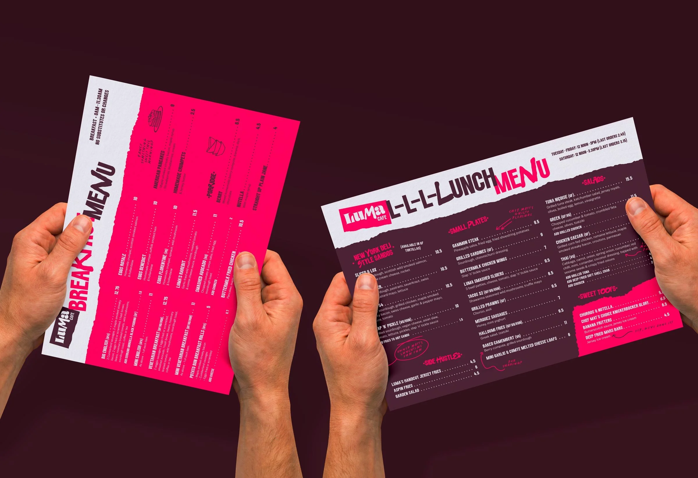
Menu Design
LuMa | 2026
Brand Identity
Menu Design
-
How it started:
Hi mate. Matt here. Hope you are well. I’ve only gone and bought a cafe/bar! Wanted some advice and help on branding/logo etc. could we meet up to discuss?
Is there a specific reason for the name?
Lucie Marie / Lucie and Matt
What makes your business unique?
Being the best at what we do with constant evolution of night menu based on current and future food trends, and creating a vibrant, artistic and funky space to hang out
If your company were a fruit or vegetable, which would it be and why?
An onion - the most versatile one of all. And although not always seen, directly essential to the base elements of a dish.
And sometimes they make you cry
Which brand archetype best suits your business?
The Maverick: You challenge the norm. ‘Why’ instead of ‘This is the way it’s always been done’.
-
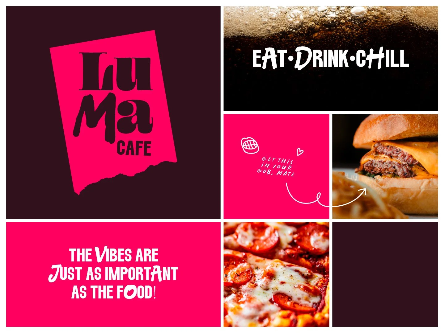
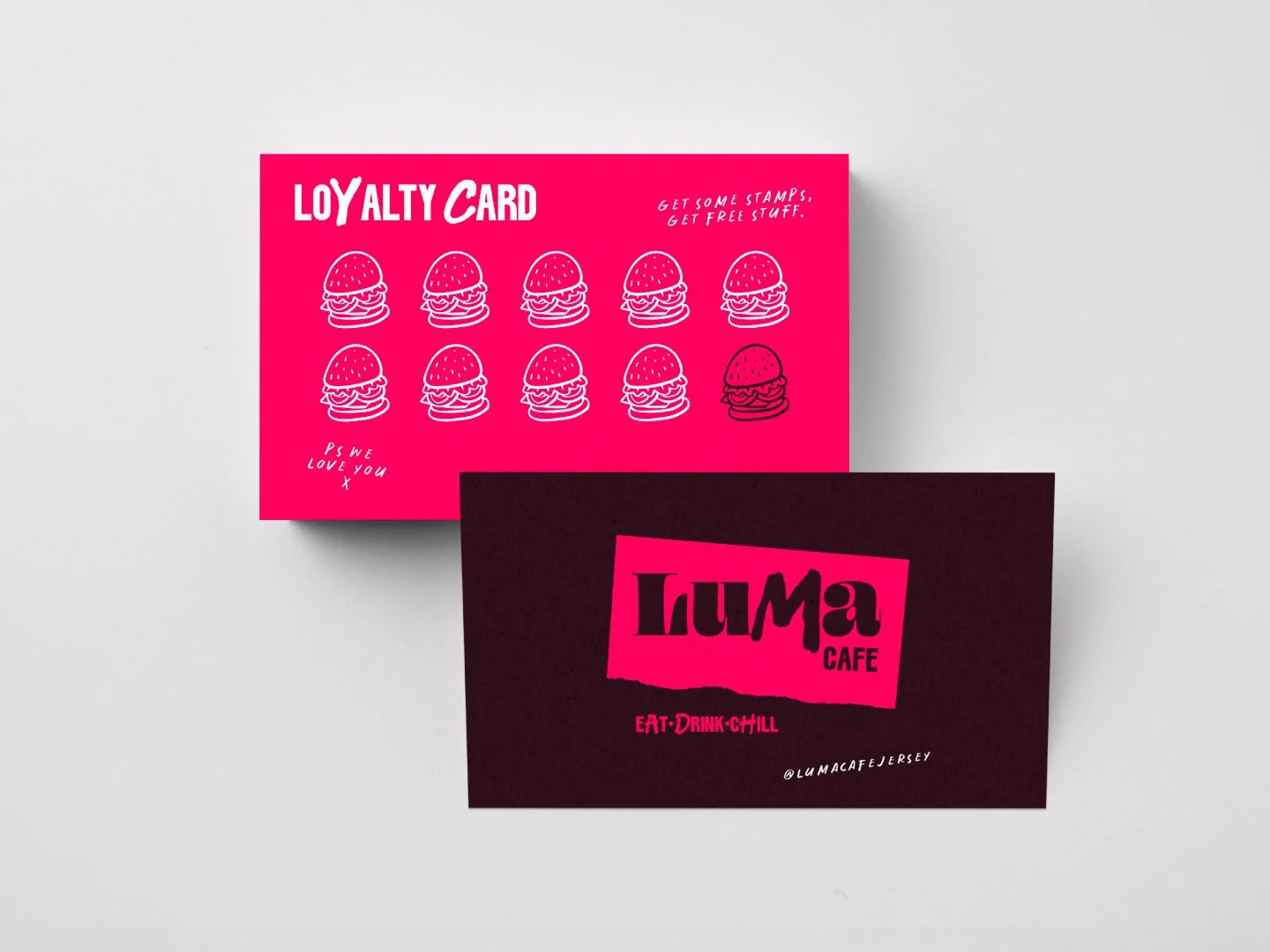
Something quite bold and brash. Very recognisable. Rebellious, quirky, creative, but also friendly.
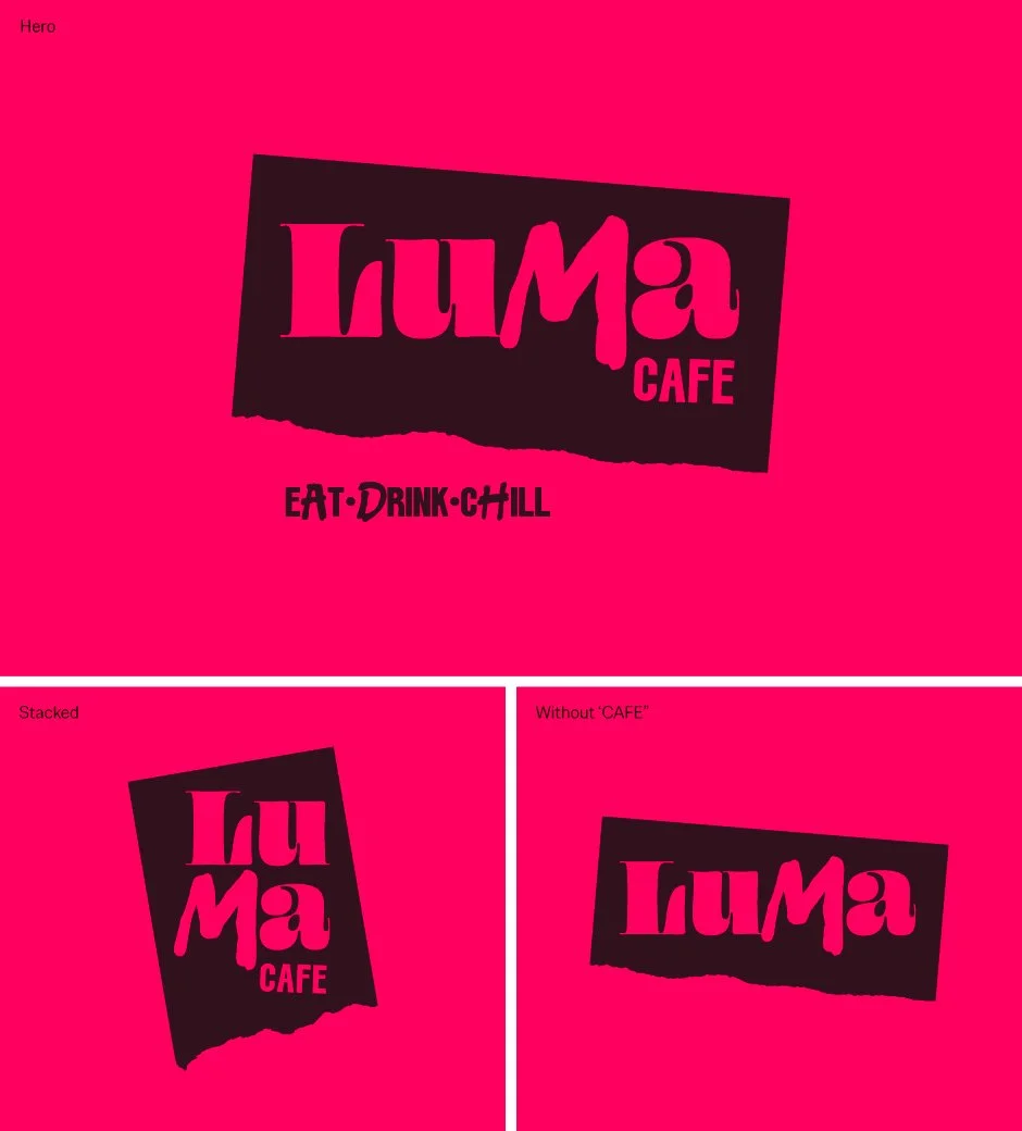
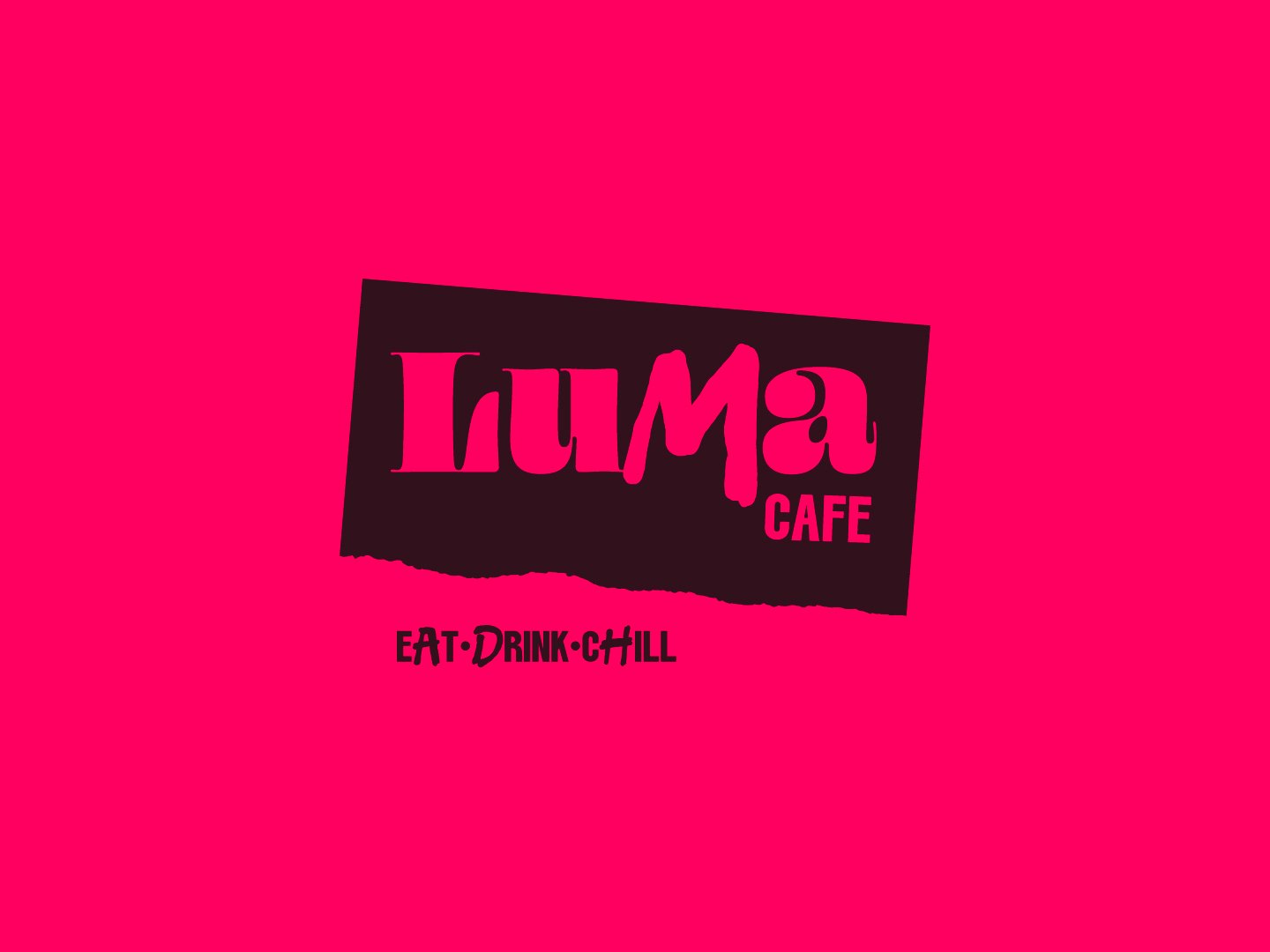
The logo font is ornate with a hand-drawn ‘M’. The combo is intended to add an element of surprise, be decorative, and playful.
The torn paper effect is added for Matt and Lucie’s art roots.
The supporting headlines continue the random hand-drawn letters, but are combined with blocky caps. This represents the two sides of Matt; the strong foundation in practical, with the arty attitude. Assertive and approachable.