Brand Identity
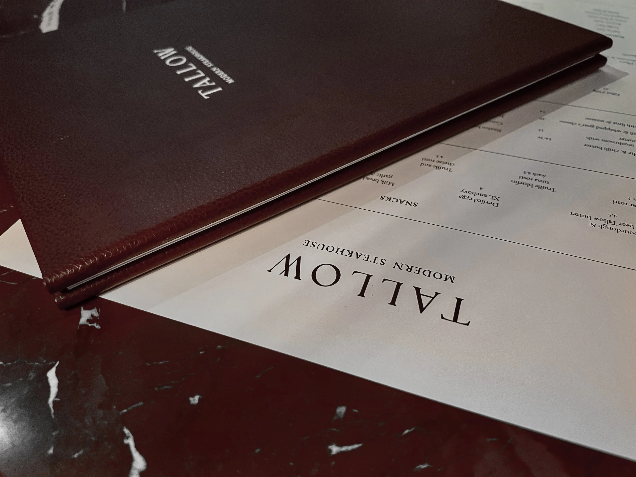
Menu Design
Image credit: Floor Ten Agency
Photographer: Jody Samantha Photography
Interior design: ATELIER NOAD & YU
Tallow | 2026
Brand Identity
Menu Design
-
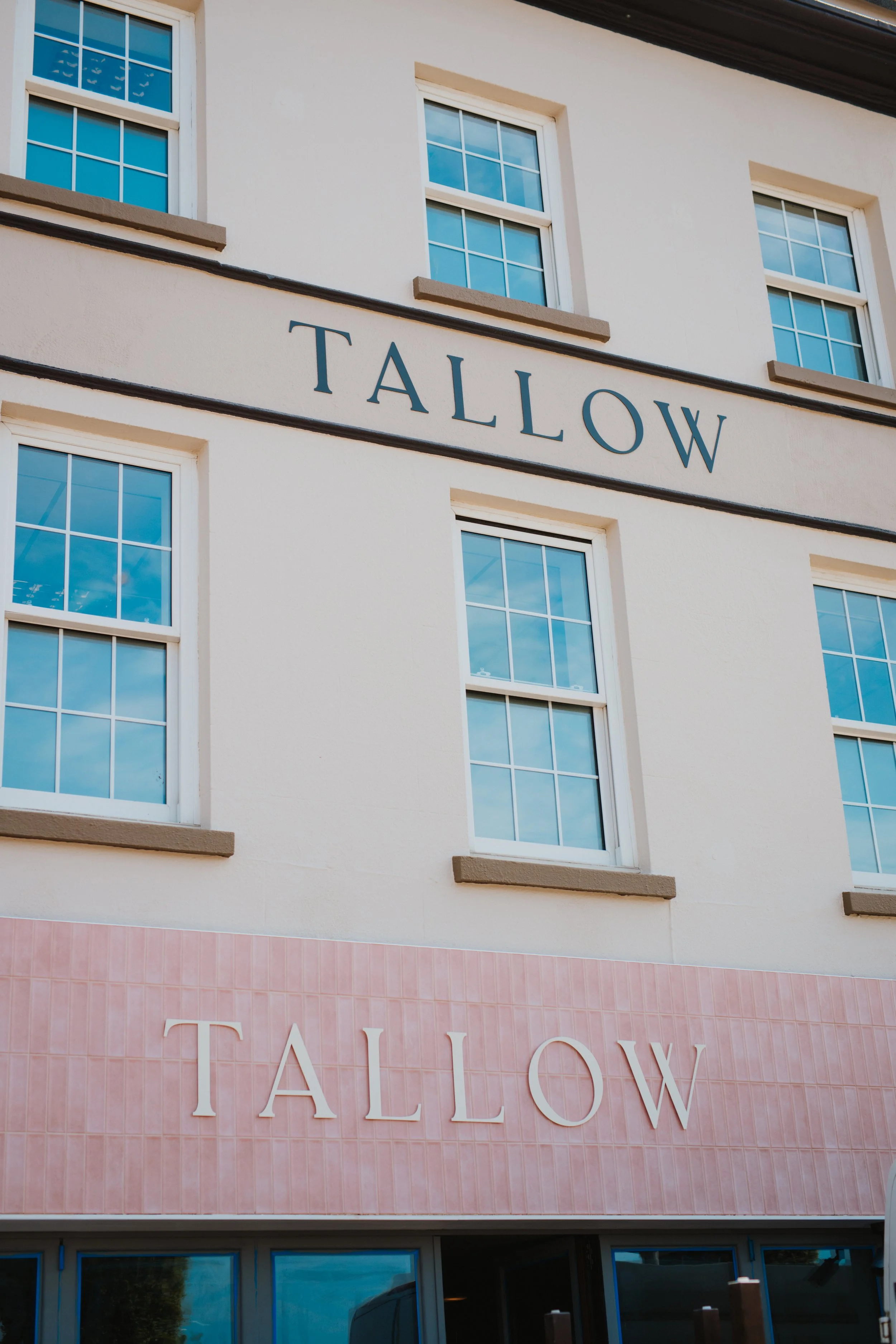
Tommy and Bruno were opening a second restaurant following the success of Tavola (which I had branded the year before). They came to me with the location, a vision, and a chosen name; Tallow.
Tallow would be a modern steakhouse focused on top quality food. The brand needed to be confident and prestigious.
-
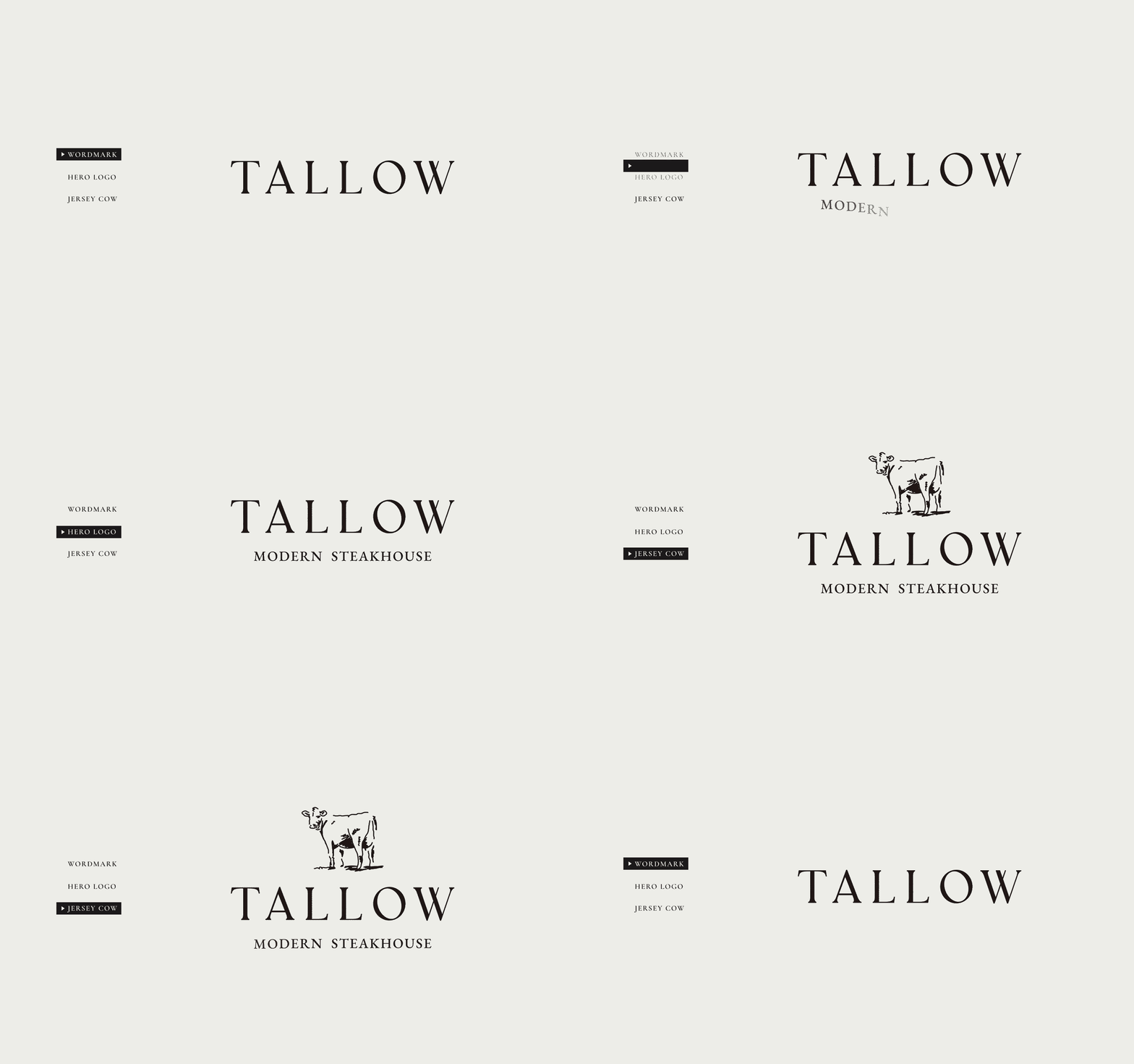
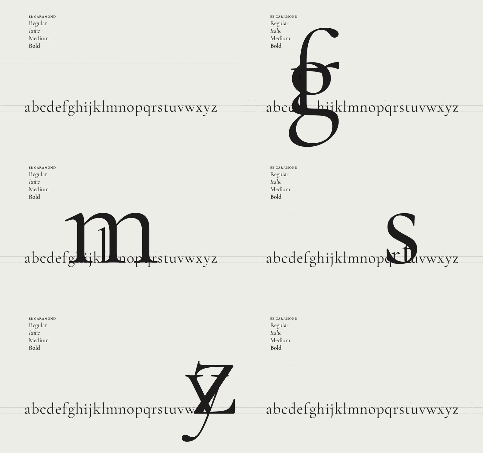
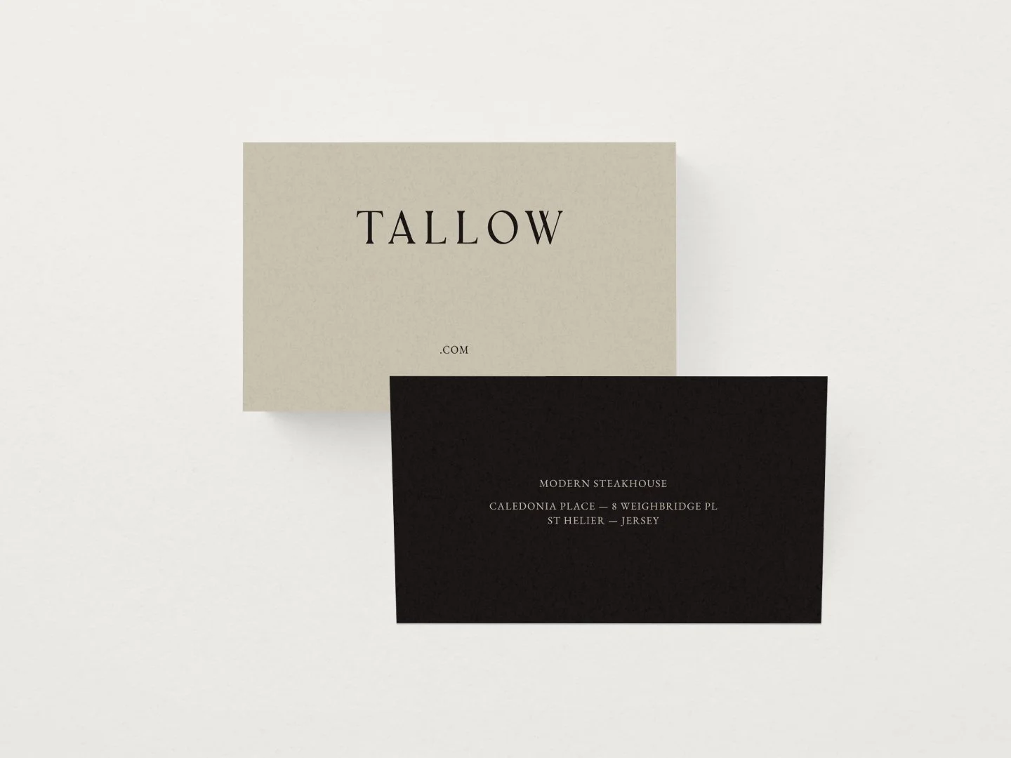
Classic typography. It takes time and patience to reach simple typographic conclusions, but that simplicity lives and breathes class. You feel class.
EB Garamond is intended to be an excellent, classical, Garamond. It is a community project to revive Claude Garamont’s famous humanist typefaces from the mid-16th century. A modern classic for Tallow, the modern steakhouse.
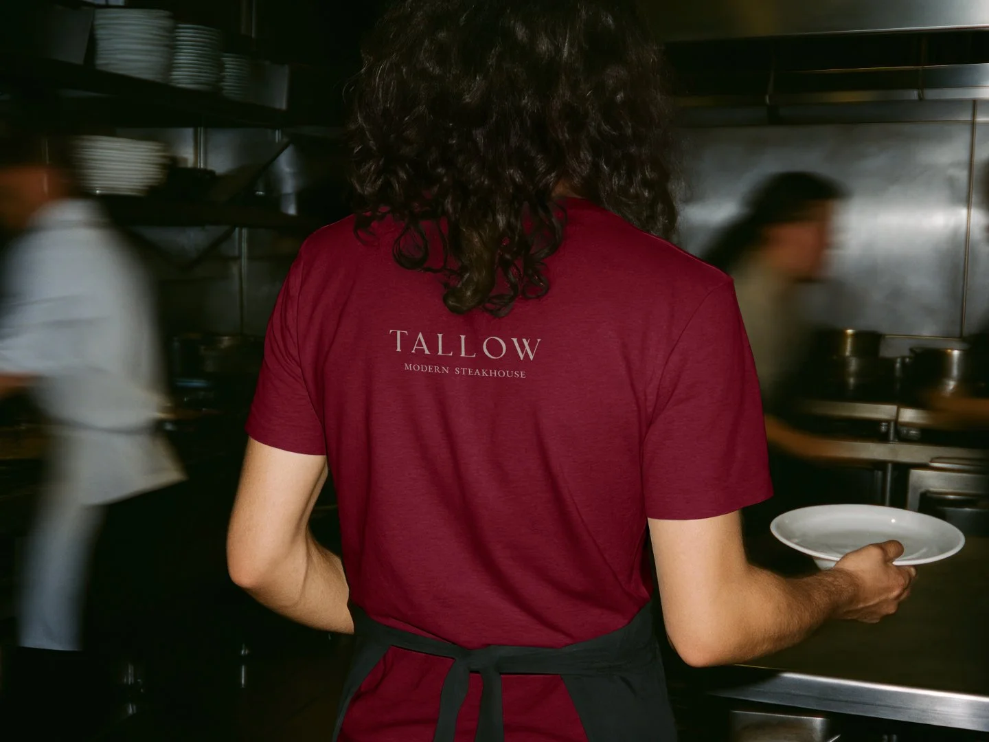
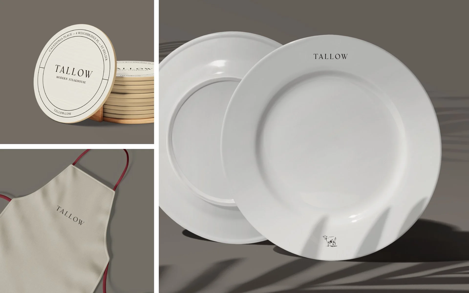
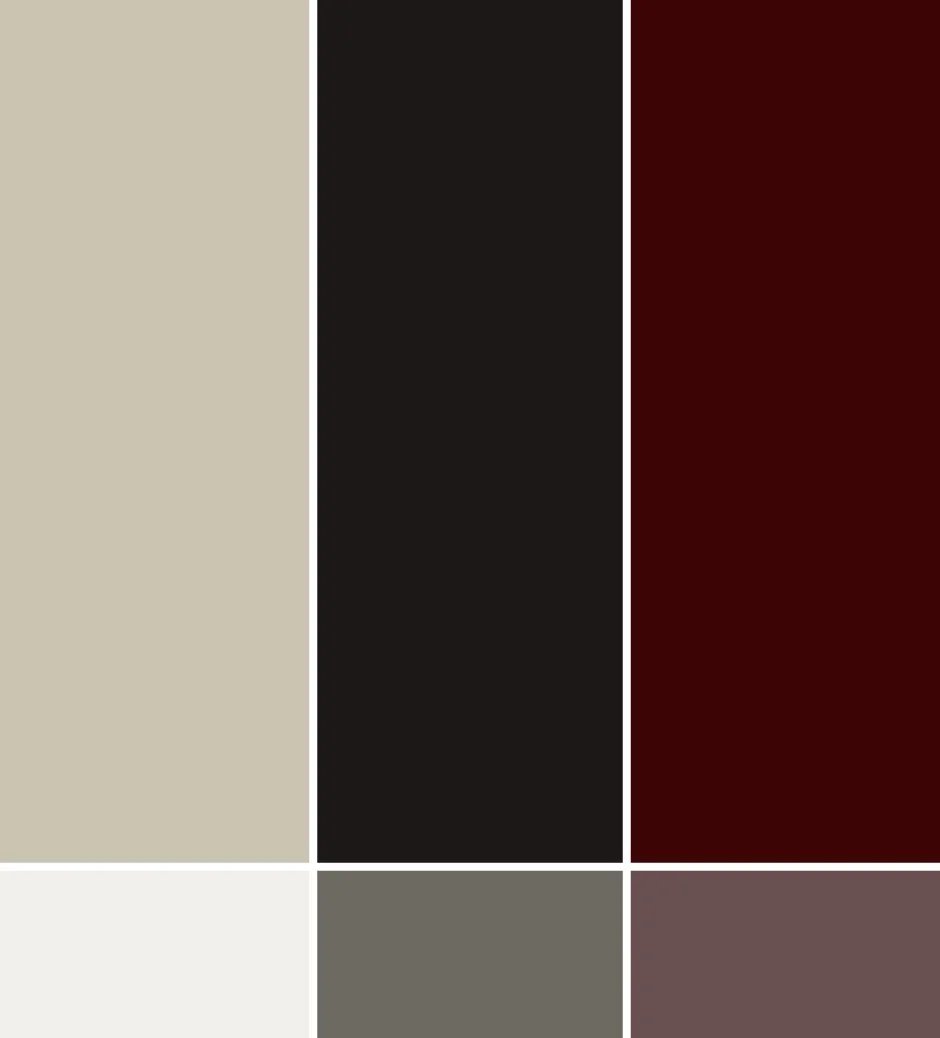
The colour palette is understated: an off-white base, dark grey for text, and a splash of rich red wine when needed. We all know that deep pinot notes seamlessly pair with gourmet steak.
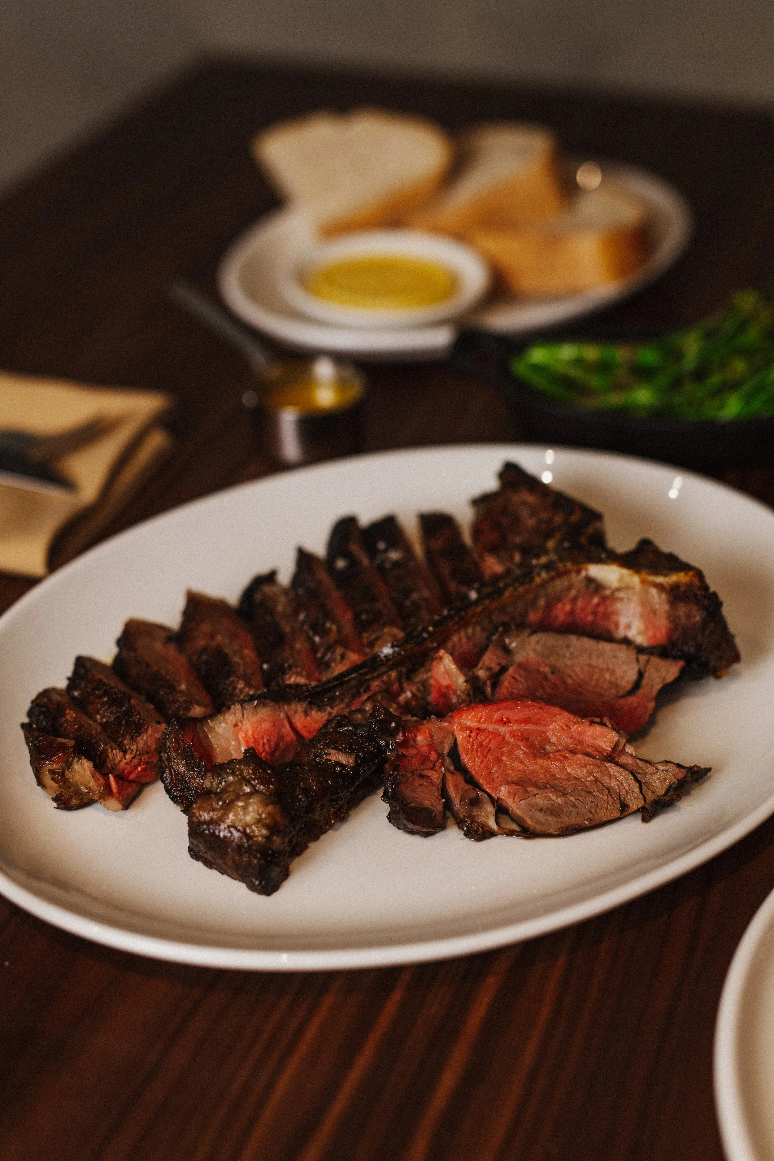
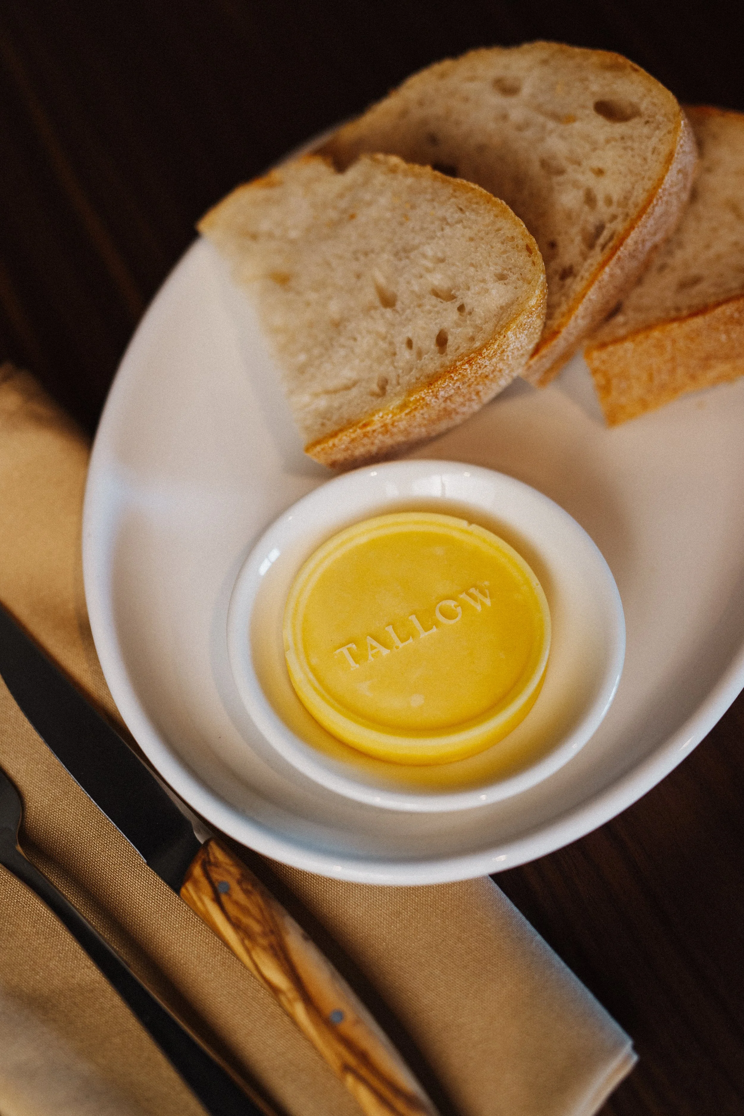
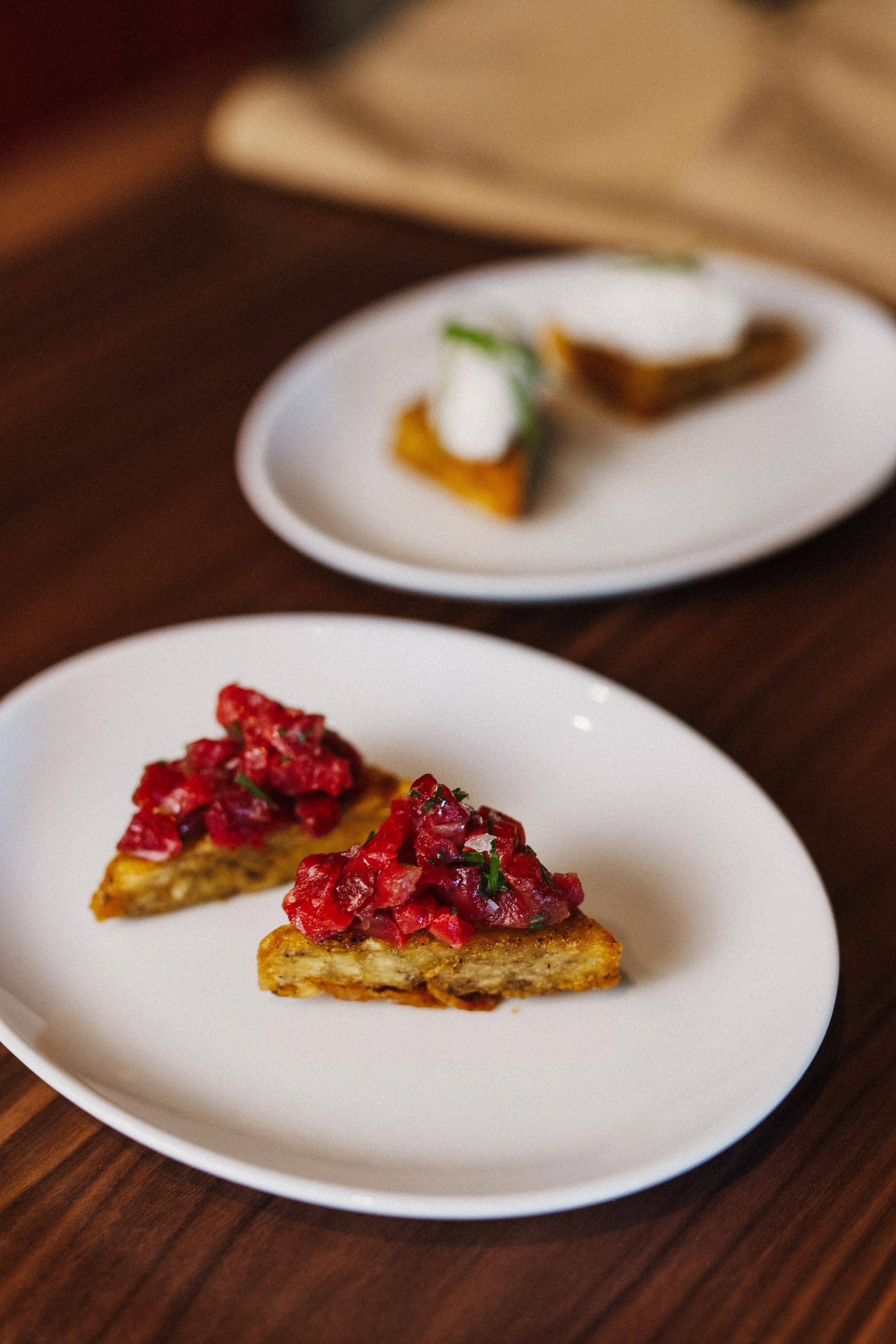
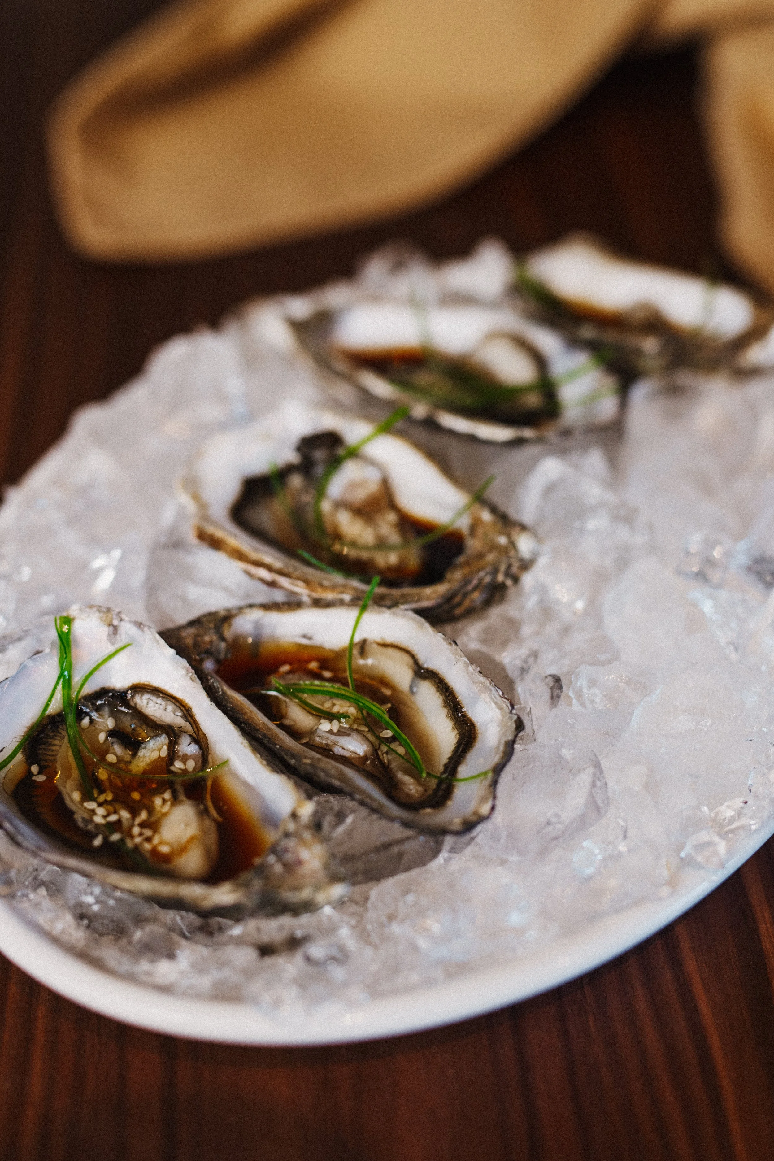
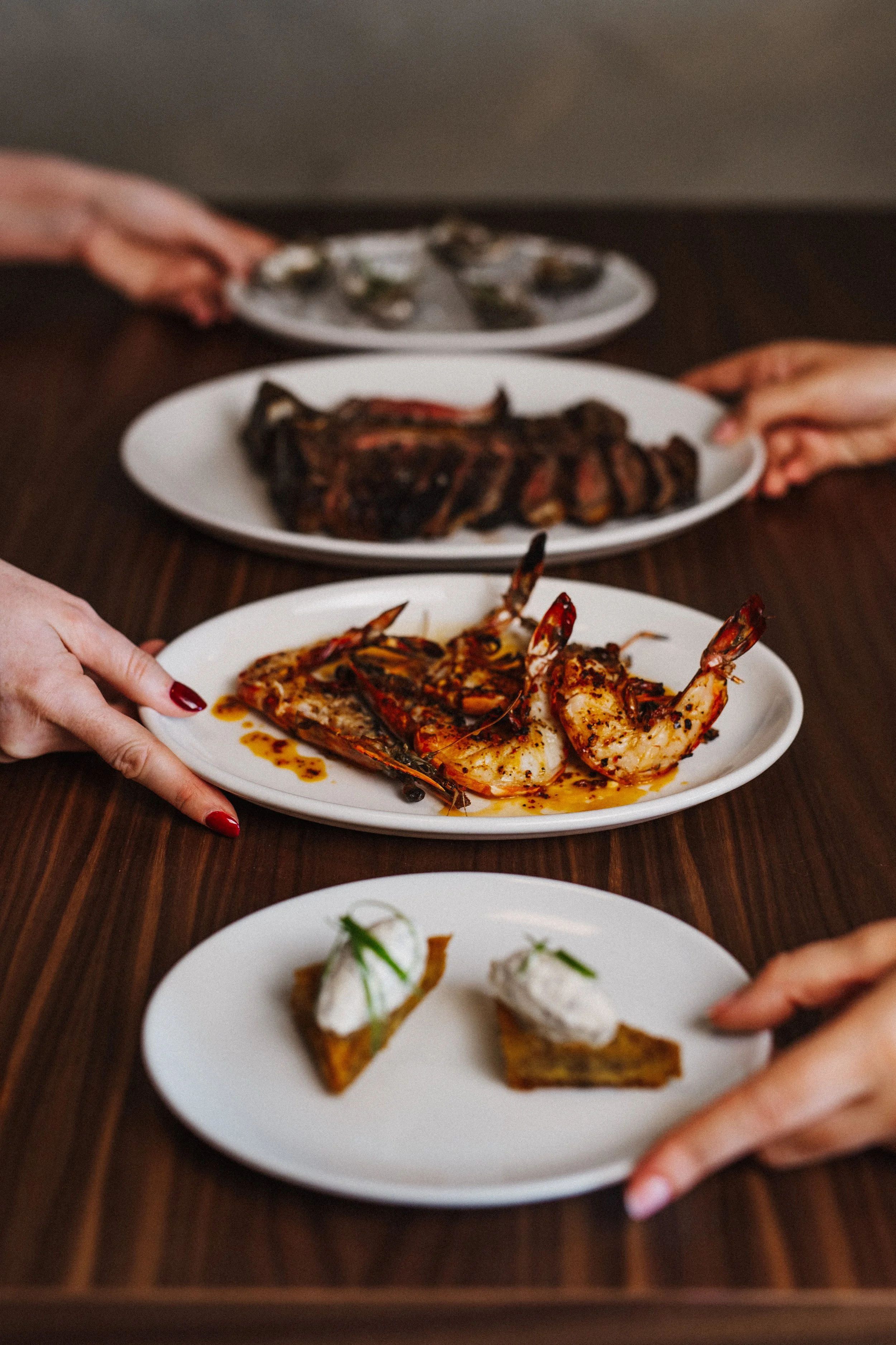
There is white space everywhere. A food menu shouldn’t feel crowded; we want eyes to glide along the page with the ease of a knife through butter. The excellent ingredients are the star; the job of the design is to deliver Grilled Jersey scallops or Tequila, finger lime & olive oil Jersey Oysters directly to the salivary glands, and onward into the waiter’s notepad.
I’ve had the pleasure of eating at Tallow. I’m 39 years old, and over the years I’ve popped many extremely enjoyable things inside my mouth. At Tallow, said orifice witnessed a collection of the finer things to enter it.