Brand Identity
Brand Book
QBIX | 2025
Making complicated, simple.
Brand Identity
Brand Book
-
Team QBIX came to me with a colour palette in mind, logo concept of a Rubik's Cube, and a swift turnaround required.
I simplified the concept significantly to make it clean, confident and professional.
As a rule of thumb, simple logos are more memorable than complex designs, as they don't contain too much visual clutter.
It also makes it easier to use on smaller digital formats/executions, which suits the modern, mobile-first business world.
-
This is part of the milk process that makes the brand visuals work:
If your company were an eatery, which one would it be? e.g. greasy spoon, lunch deli, gourmet restaurant, Michelin star etc.
“We would be a private Chef, someone who comes and understands your needs and delivers in your home.”
Good answer!

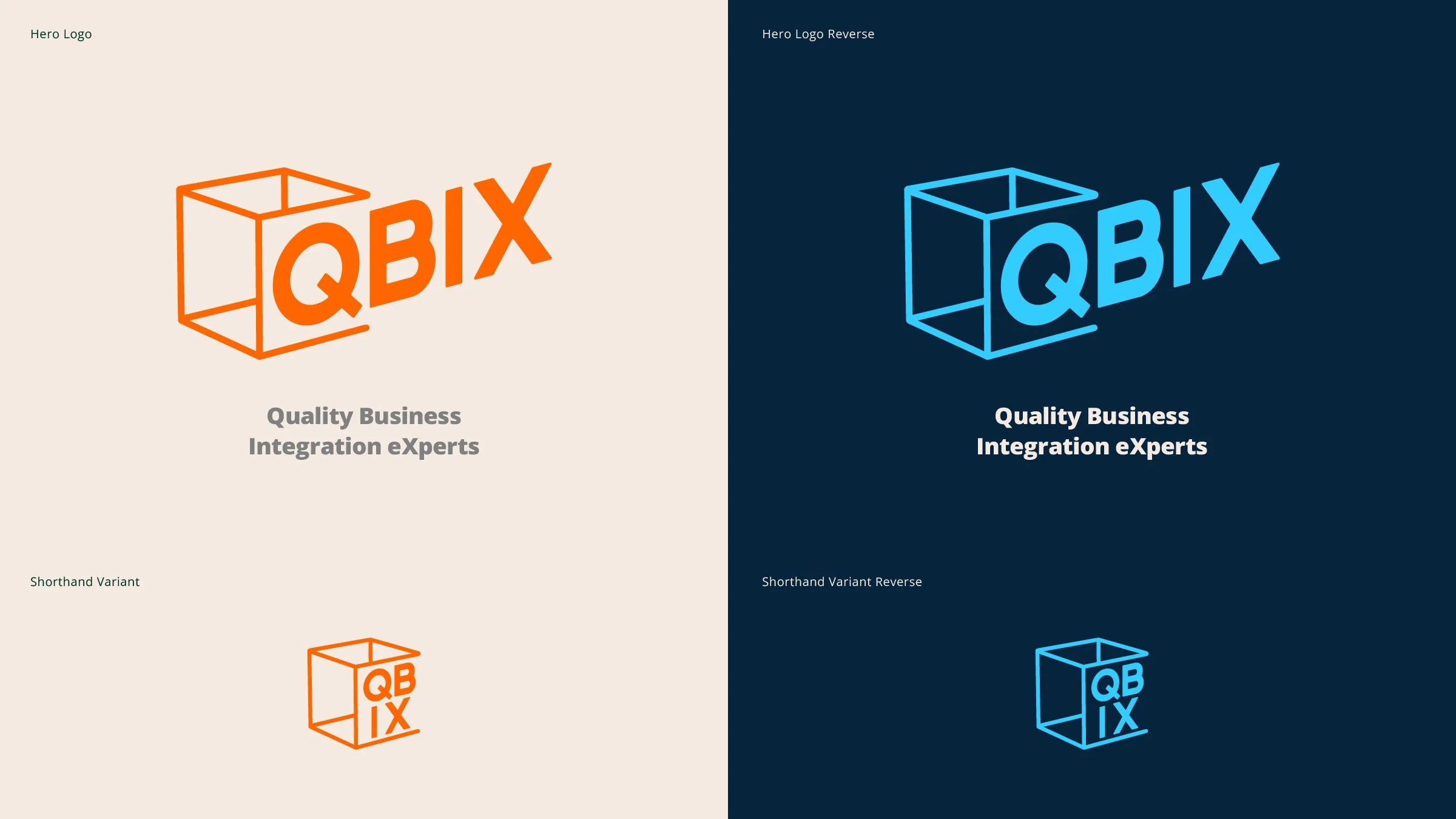
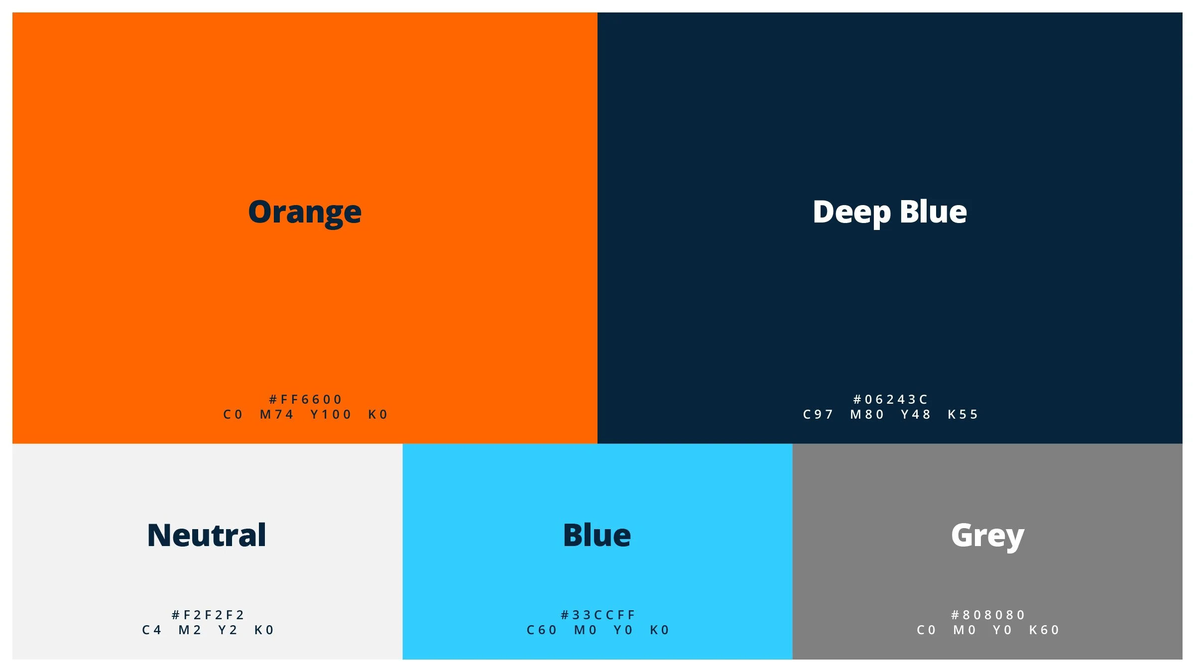
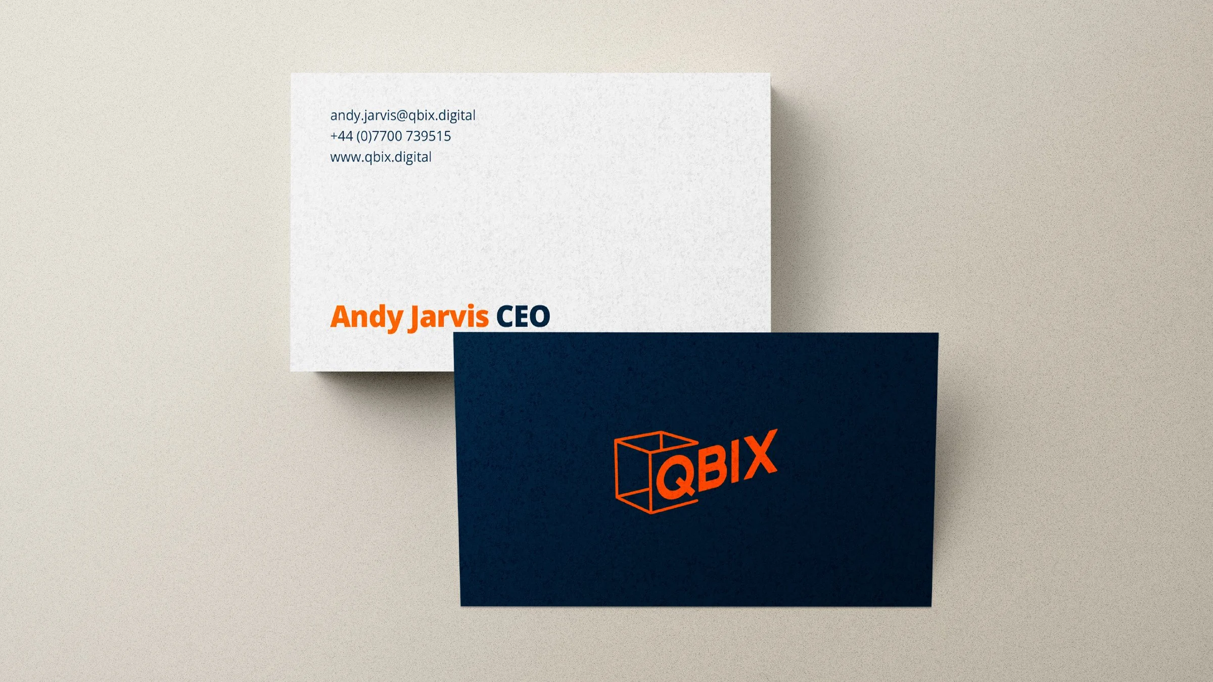
Selected pages from the brand style guide.