Event Brand Identity
Event Deck
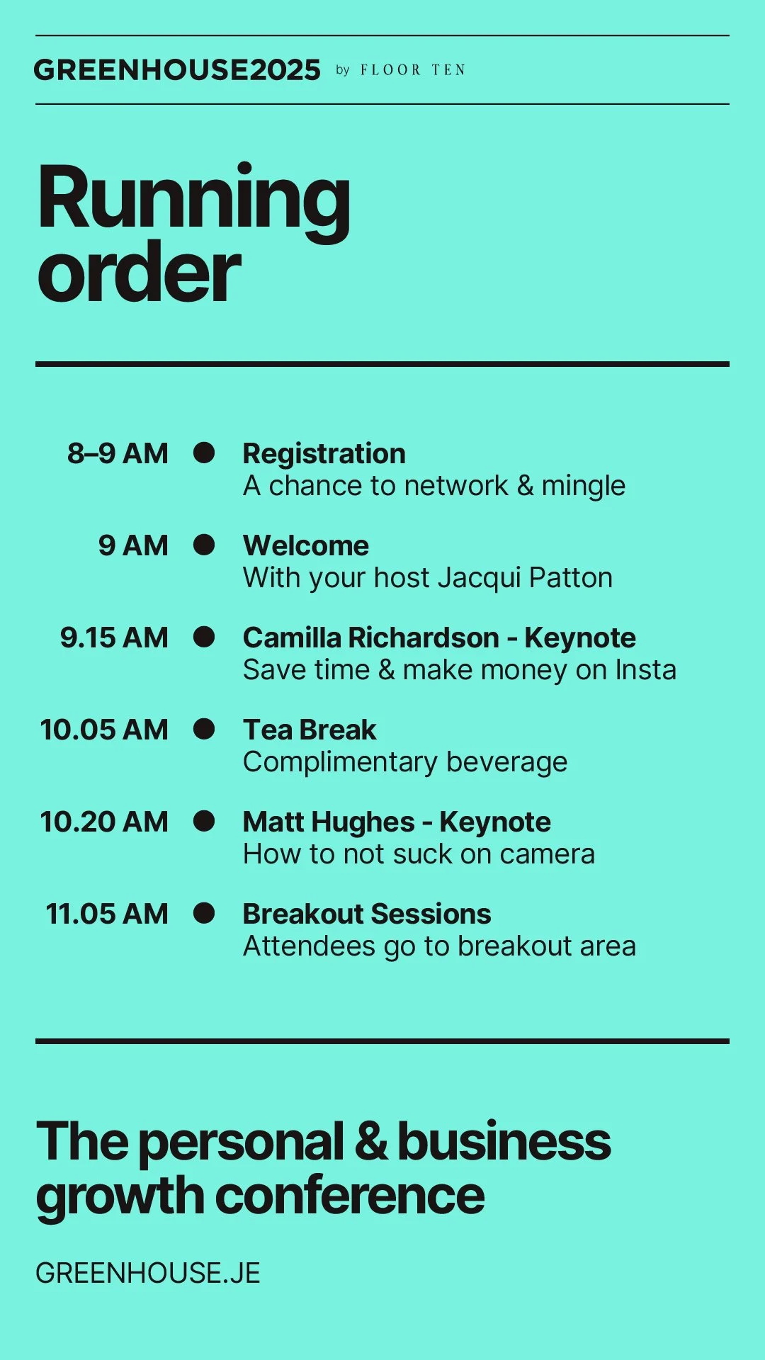
Event Workbook
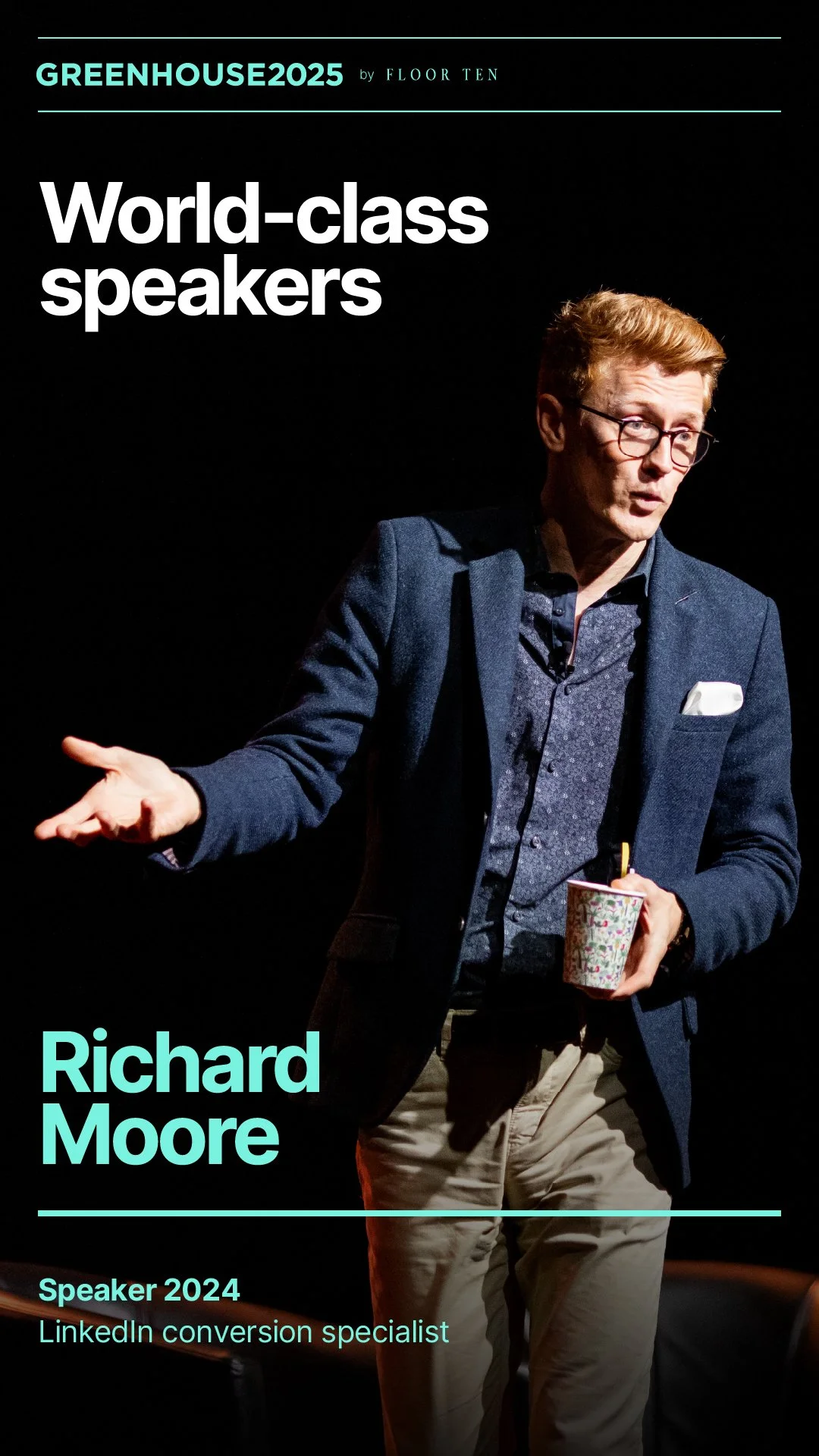
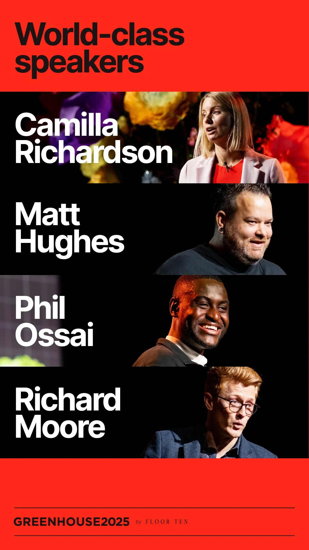
Social Media Templates
*Event brand and design partner
Greenhouse by Floor Ten | 2025
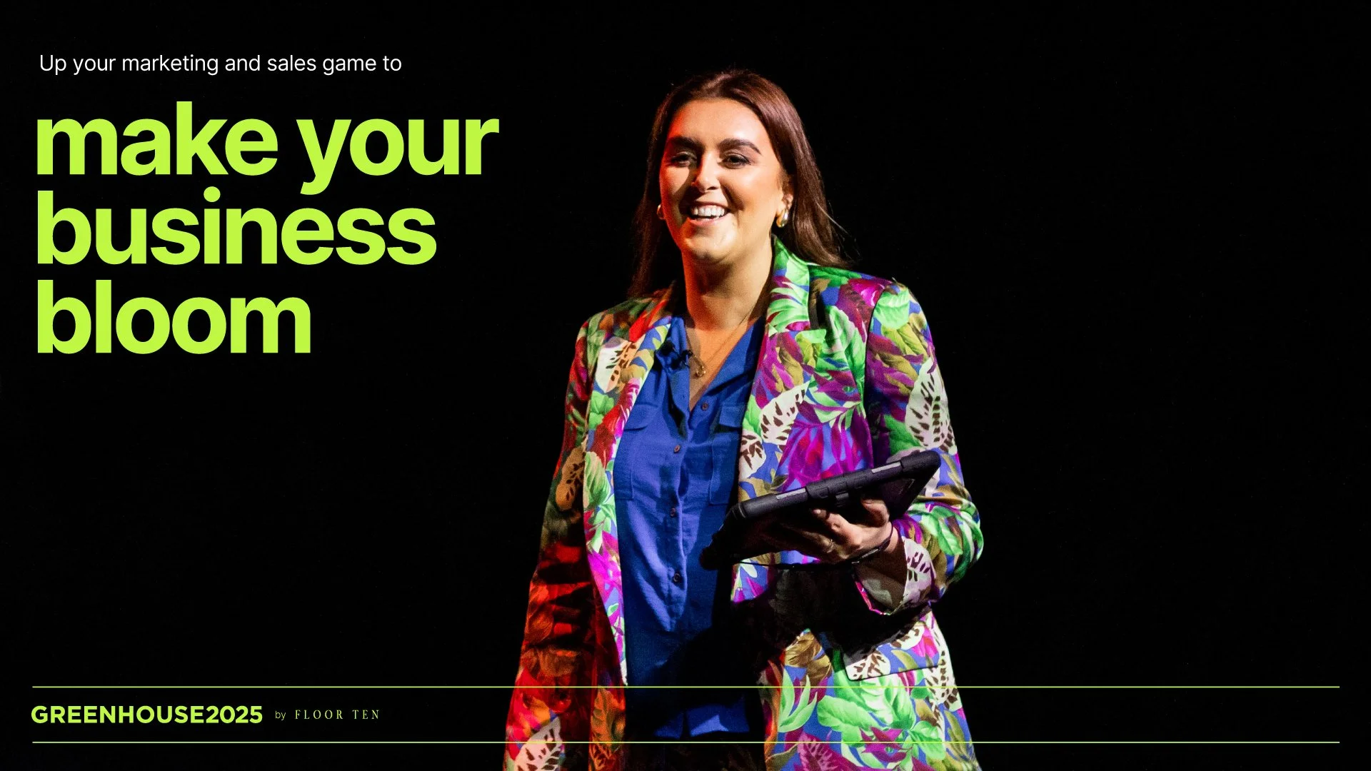
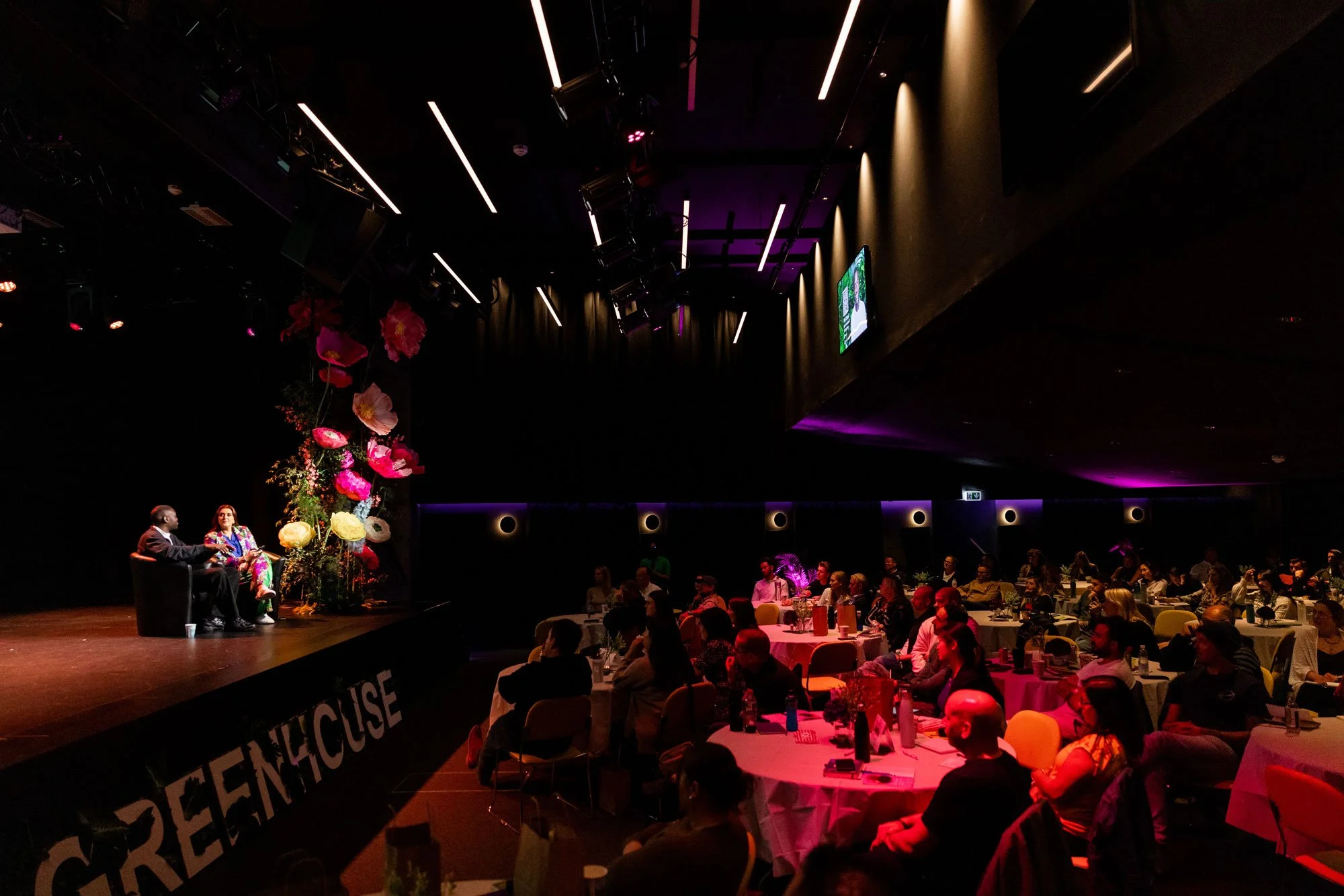
THE Jersey marketing and sales event.
Event Brand Identity
Event Deck
Event Workbook
Social Media Templates
*Event brand and design partner
-
Sometimes it’s the right time for a freshen-up. The visual starting point no longer aligns with the rest of the brand experience.
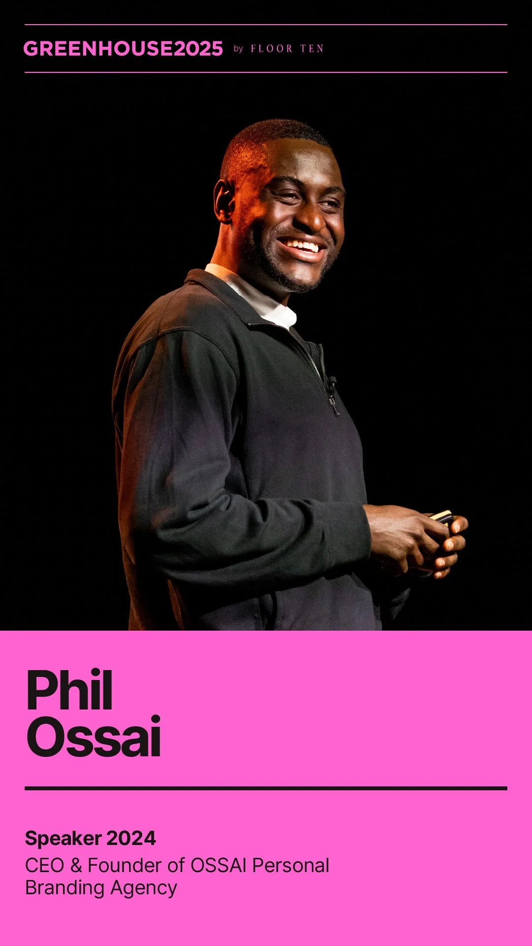
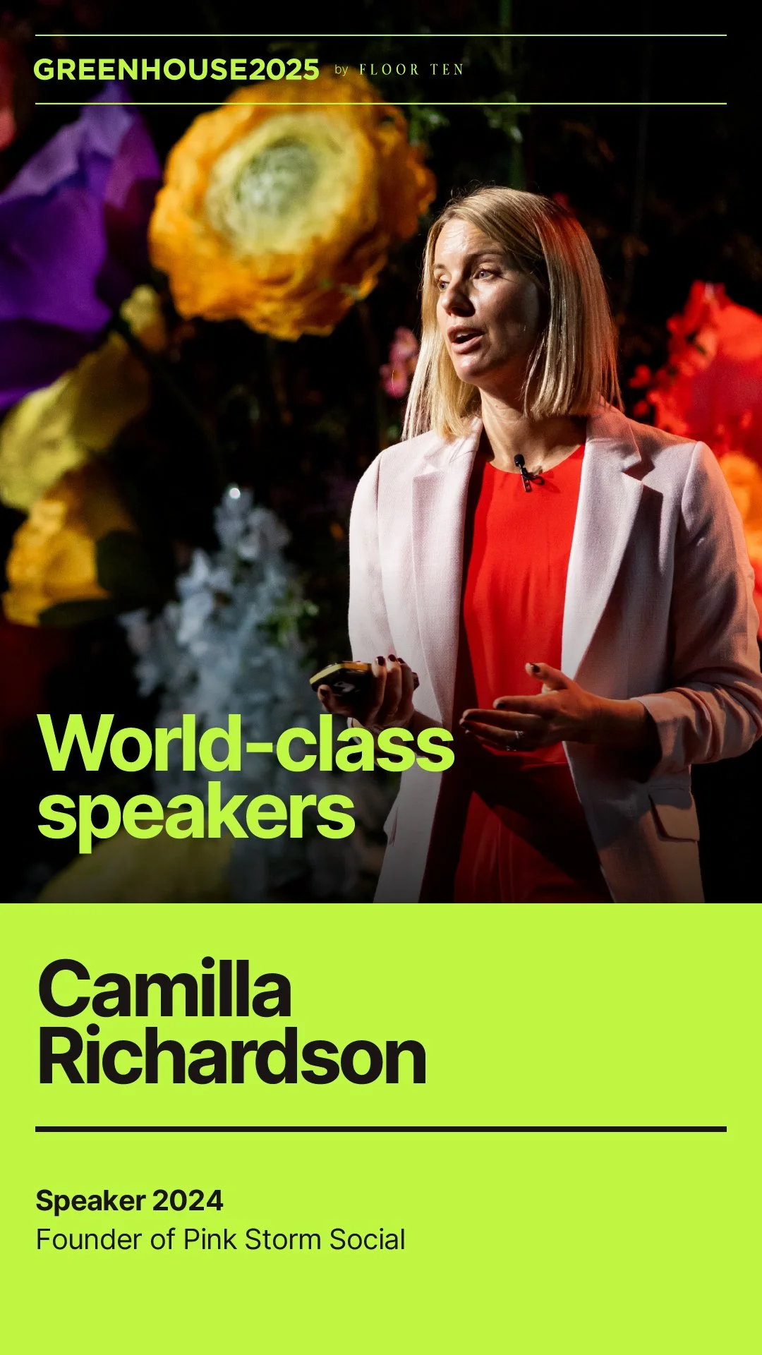
Greenhouse: THE marketing and sales event of the year.
The brief in brief from Jacqui:
We need to bring it into 2025 a bit more and make it feel more grown-up because as the event gets better and better, and I obviously want the look and feel to get better and better!
—
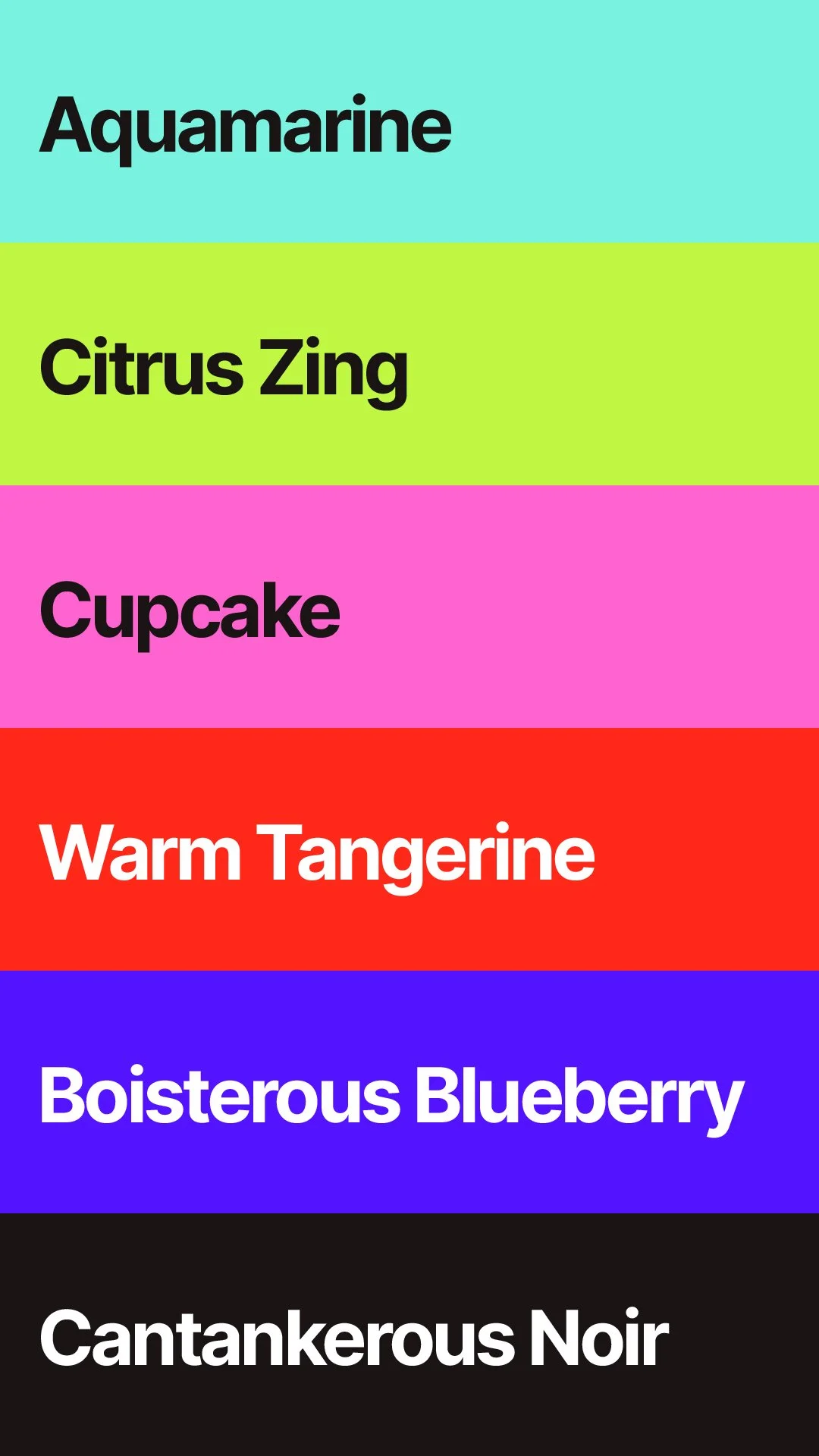
The vibe of the event is bold and upbeat. The colours needed to retain that energy while being pushed into a more grounded place than the previous palette. Trusted but also fun.
I took typographic inspiration from compact information design—most notably NYC Subway signage—due to the high level of written content the event needs to convey. You’re glad I did because you think it looks great, don’t you?
As you imagined, the font used is ‘Inter’. A modern workhorse of a typeface that’s as versatile as a slice of white bread.
There’s more to it. If you buy me a coffee, I’d be happy to explain further.
—
Upon seeing the first visuals, Jacqui offered: “Well I bloody love it.”
-
I work with clients I believe in.
I endorse this event strongly enough that this year I have joined the newly formed Greenhouse Committee AND am sponsoring the event (by way of this brand refresh).
For me, the major pro of Greenhouse is the room filled with positive human energy. People with a growth mentality who—whatever stage of career/business they are at—want to improve and are willing to invest in doing so.
If you’re the kind of person who likes to invest in feeling inspired to act positively for your career, then you’ll probably enjoy Greenhouse too.